GLOBAL FOOTPRINT NETWORK
CONTEXT
The Global Footprint Network is an independent, charitable not-for-profit organization research institute based in the United States, Belgium and Switzerland.
GFN develops and promotes tools for advancing sustainability, including Ecological Footprints and Biocapacity, which measure the amount of resources we use and how much we have. These tools aim at bringing ecological limits to the center of global decision-making.
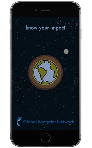
Click iPhone for clickable prototype
Overview
SOLUTION
UX Team needs to redesign the calculator to be an interactive smartphone app with social media integration.
MY ROLE Research, Infographics, User Personas, Wireframes, UI Library, & "Eco Hacks"
TOOLS Illustrator, Photoshop, Invision, Creative Cloud, Google Slides, The Noun Project, Whiteboard, Expo Markers
PLATFORM Mobile App
DURATION 2 weeks
CHALLENGE
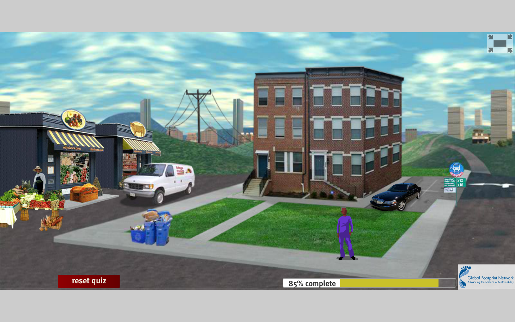
The Global Footprint Network has a “Footprint Calculator” that determines your ecological footprint based on a questionnaire. Currently, the calculator is in the form of a web-based Flash animation.
UX TEAM
Angel Pang • Research, Wireframe, Prototype
Crystal Chen • Research, Information Architecture, Wireframes, & "Eco Facts"
DELIVERABLES
1. Global Footprint Network clickable prototype app
2. Revised Ecological Footprint Calculator Questionnaire
3. Global Footprint Network Rebranding
1. RESEARCH
The Global Footprint Network is one of the most important resources we have to realize the human impact on a global scale. Their technology shows us our potential to unite in attempting to save our planet. Yet while they have fantastic tools to help countries, cities, and individuals understand climate change & human impact...
their website is not the friendliest user experience.
Currently, to measure your ecological footprint, you have to follow an animated augmentation while answering a questionnaire on the habits of your lifestyle.
It was a really different way to fill out a form.
The biggest problem was that this augmented world/calculator ran on Flash.
We user-tested the current GFN site to counter our initial heuristic evaluations.
Overall we got really mixed reviews from users and essentially they didn't like it.
Most importantly, they didn't learn how to change their lifestyle.
Global Footprint Network's current Ecological Footprint Calculator
The greatest challenge of this project was to rapidly learn about climate change, a complicated and heated (pun intended) issue that most of the world doesn't understand.
We also had to condense this knowledge & terminology into an interactive & effective mobile application.
This is the Global Footprint Network's brand identity
Here are infographics I made to help breakdown some of our data analysis
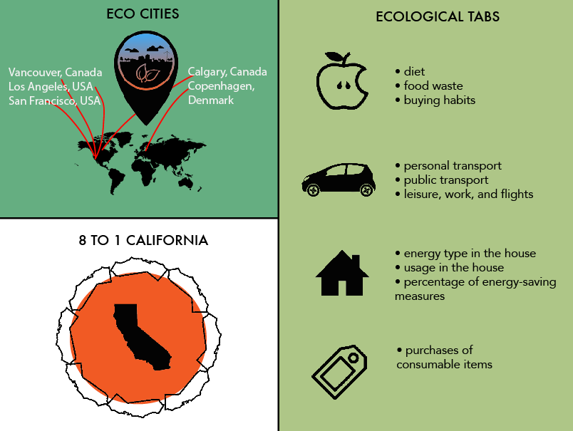
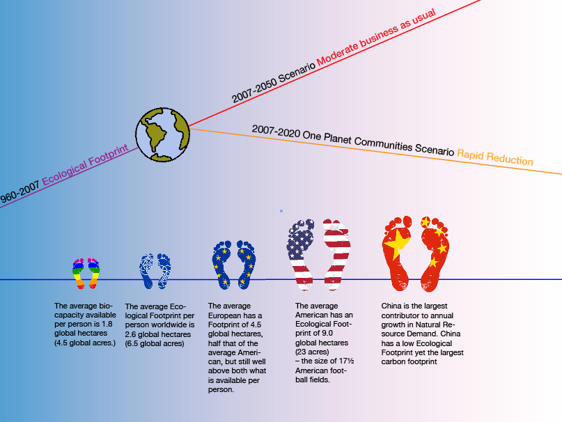
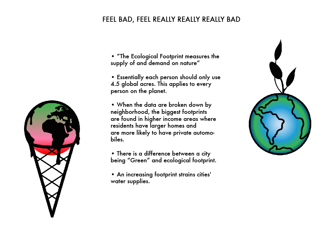
And Our research on GFN's comparrative/competitive analyses
•eco footprint calculators online
•eco lifestlye &/or footprint calculator apps
•greenest cities in the world
•countries with biggest footprints
2. STRATEGY
Firstly, we identified our range of users. We needed to find people whose lifestyles where on opposite ends of the "going-green" spectrum.
Meet Joyce & Chuck
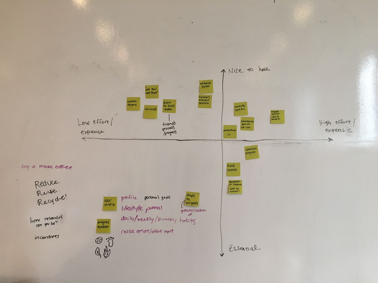
We brainstormed The most valued features for them
& defined those features
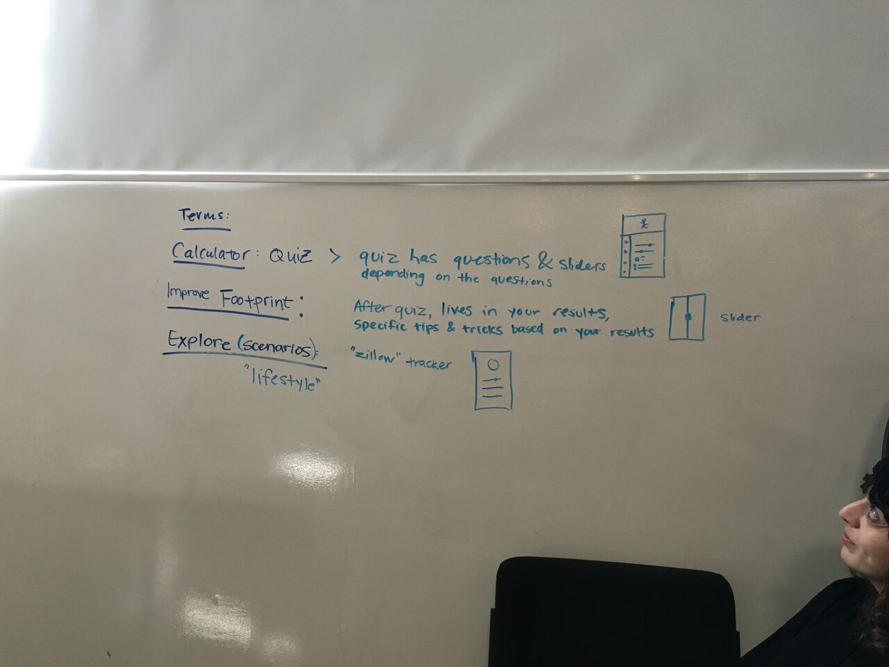
Next, we made our information architecture and three user flows. This was because each user had different user journies while using the app
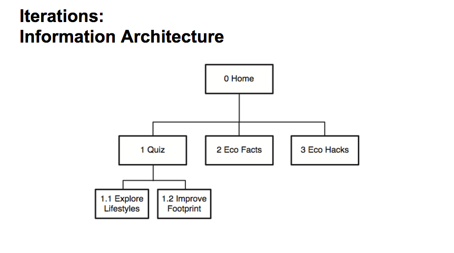
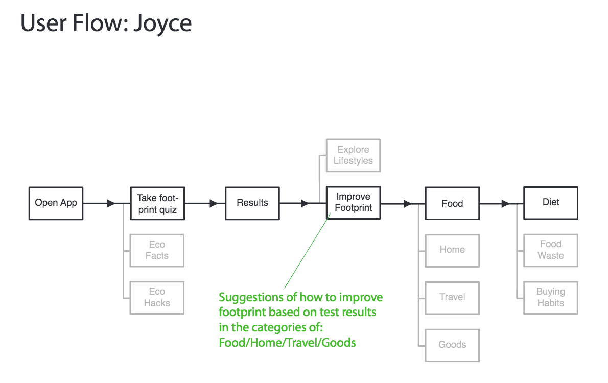
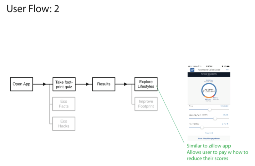
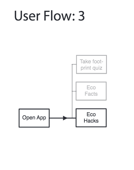
From here we were ready to begin wireframing.
3. DESIGN
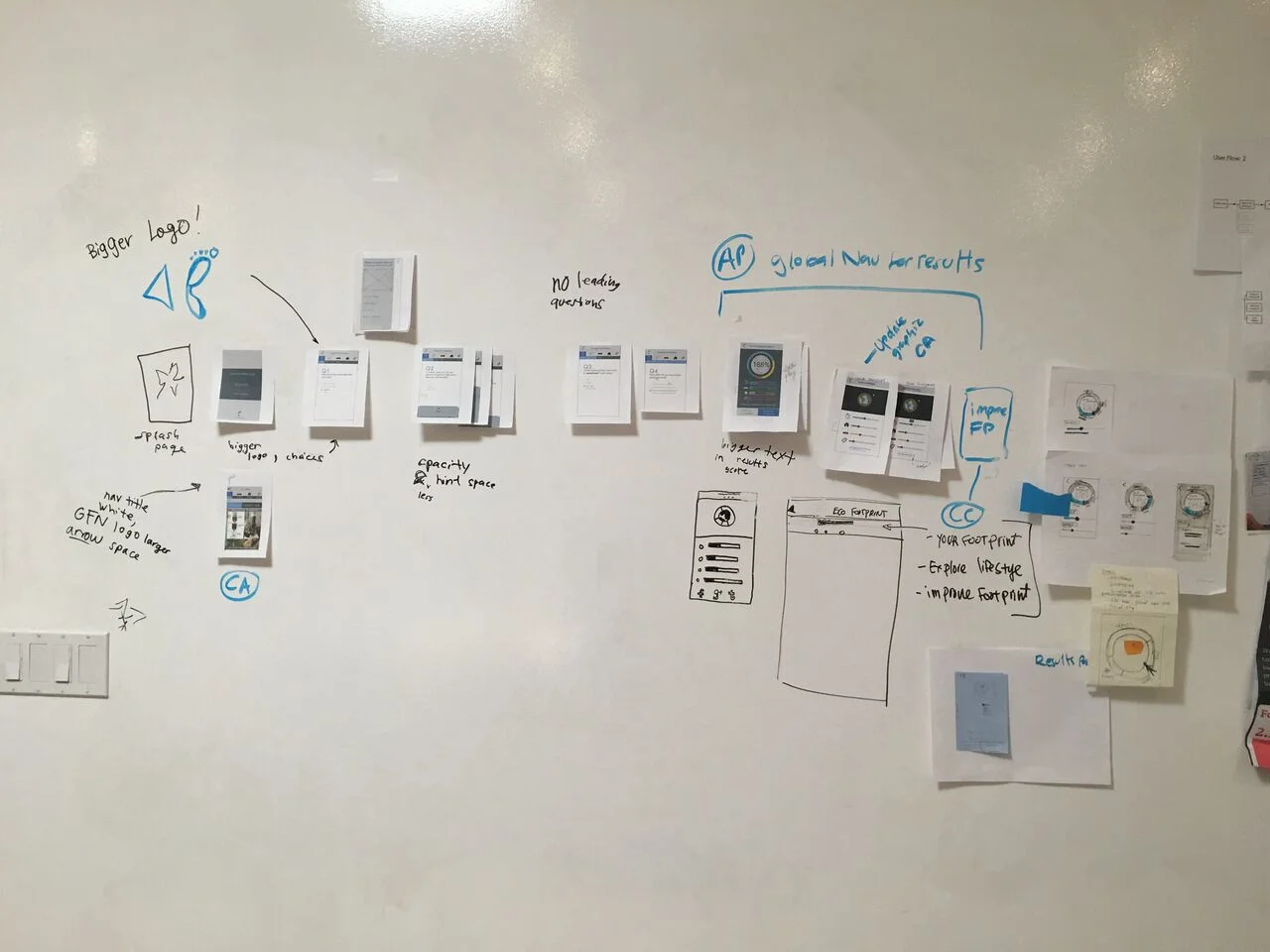
Lean UX helped us complete iterations of lo-fi wireframes, followed by guerilla testing.
My team broke up tasks to divide and conquer.
I made the UI Elements used in the prototype
