AMOEBA MUSIC
CONTEXT
Amoeba is a non-corporate music outlet, an e-commerce website, a popular live performance venue, and a meeting place for California’s most colorful community of progressive and creative minds. With three locations in the sunshine state of California, Amoeba is the largest record store in the United States. They're also ready to update their accessibility online while maintaining
their alternative style and culture.
SOLUTION
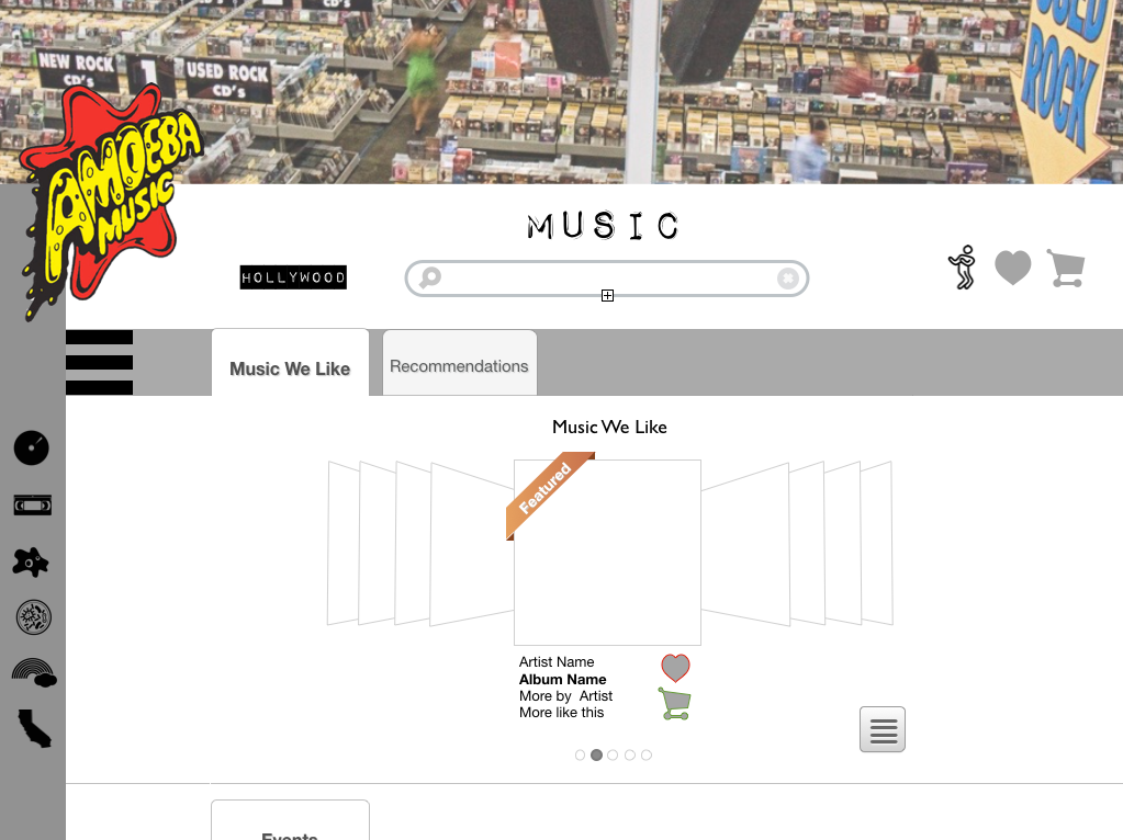
Create an e-commerce site that augments the in-store shopping experience,
as well as allow users access to shopping and music discovery remotely.
PLATFORM Web & Mobile
TOOLS Keynote, Photoshop, Gliffy, The Noun Project, Pencil, Paper, Whiteboard
CHALLENGE
Amoeba Music wants to extend their in-store experience to mobile and web, offering a user-friendly way to navigate their enormous inventory.
ROLE UX Designer
DURATION 2 weeks
DELIVERABLES
•Clickable Mobile Prototype
•Wireframe Desktop Site
1. RESEARCH
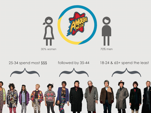
Before starting this process, I first had to understand the demographics of Amoeba's customers. So I went to their Hollywood store and interviewed two employees & the site manager.
These are infographics I made to break down the data.

Secondly, I made a Competitive/Comparative analysis for context to Amoeba's industry.
2. STRATEGY
The most difficult task in this project was card sorting Amoeba's massive amount of content and features on their site. Yet once that was sorted, understanding the user's navigation to checkout was quite simple.
I identified Amoeba's range of users
And card sorted and site mapped their entire online library
Amoeba Music Site Map
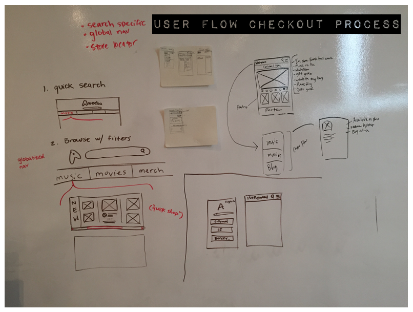
And Lastly, determined the user flow for the CHECKOUT PROCESS
Amoeba Music User Flow for Checkout Process
3. DESIGN
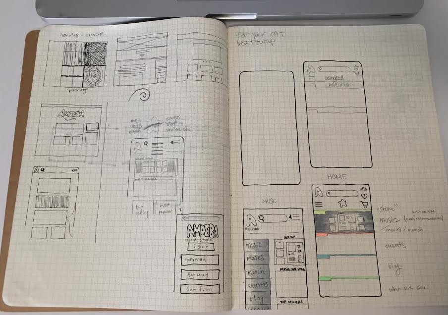
WEBSITE REDESIGN, ITERATIONS, SKETCHES, COLLABORATIVE DESIGN STUDIO
